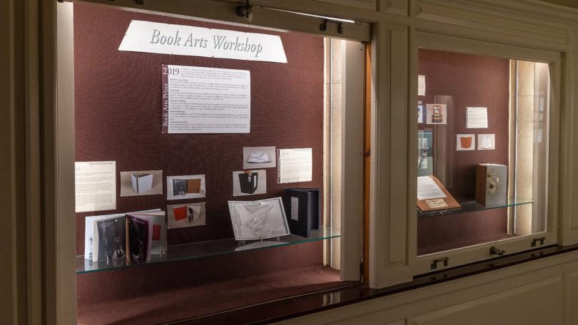
Every Spring, we hold a competition for the Book Arts Prize. With a number of categories for you to enter, you can win a monetary prize and have your work exhibited for all to see! Find out more about the Book Arts Prize and how to enter by clicking here.
After the contest is over and winners have been chosen, the winning pieces are displayed in the cases outside the Treasure Room in Baker-Berry!
Examples of some past Book Arts Prize winners
2016 Grand Prize co-winner
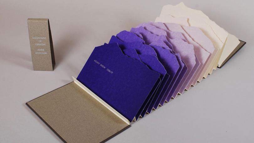
2016 Grand Prize co-winner "Mountains of Vermont" by Marie Schwalbe '16
"Mountains of Vermont depicts some of the highest and most uniquely shaped peaks of the Green Mountains to create an interactive landscape in book form. The pages are hand-cut silhouettes, each printed with a different shade of purple to create atmospheric perspective. The text, which contains peak names and elevations, emulates the survey markers found on the tops of mountains. Turning the pages of the book takes the reader on a trip from southern to northern Vermont, while stretching out the accordion fold creates a three-dimensional mountainscape." - Marie Schwalbe '16, Engineering and Physics Major

2016 Grand Prize co-winner
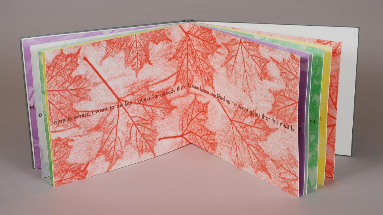
2016 Grand Prize co-winner "This Must Be the Place" by Kassie Amann '16
"This piece uses leaves that remind me of my homes in Salt Lake City, Hanover, and my grandparents' home in Rochester, NY. The words printed over the pressure prints are to a song, "This Must Be the Place" that reminds me of my multiple homes. The words flow through the drum-leaf bound pages, and are split so as to lead the reader through them." - Kassie Amann '16, Biology Major, English Minor
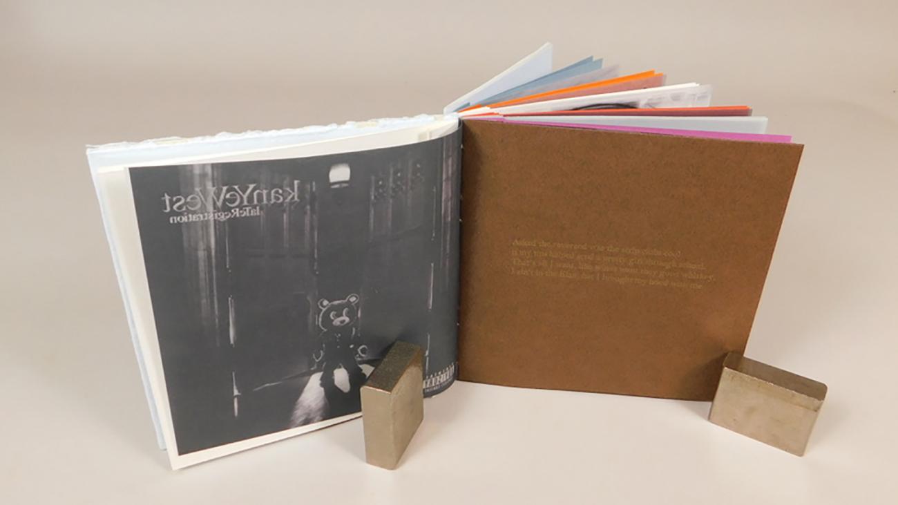
2019 Grand Prize winner
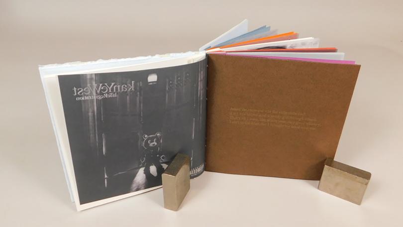
2019 Grand Prize winner "Progression of Kanye" by Jackson Rich '21
"This book goes through all of Kanye West's discography in chronological order. Two lyrics were chosen from each album, representing Kanye's mindset at each point in his career, and is bound in eight groups (one for each album). The cover art for each album is printed digitally on transparent paper and is directly followed by the lyric pages, which are the primary color of each album. The lyrics are letterpress printed in the secondary color of each album. An open spine was chosen to represent Kanye's transparency during each part of his career." - Jackson Rich '21

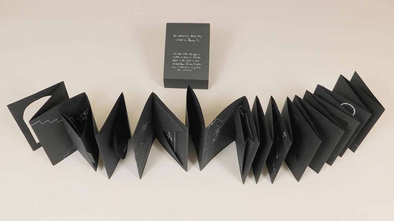
2019 Artist Book Prize winner
2019 Artist Book Prize winner "Under the Light of the Two Moons" by Spring Yu '19
"This piece is a fictional narrative picture book about a girl’s escape from a tower and the monsters inside of it. It is a pop-up book that requires interaction to be read properly. The illustrations and text utilize both black and white ink, making some information harder to find than others, while maintaining the tone of the piece." - Spring Yu '19
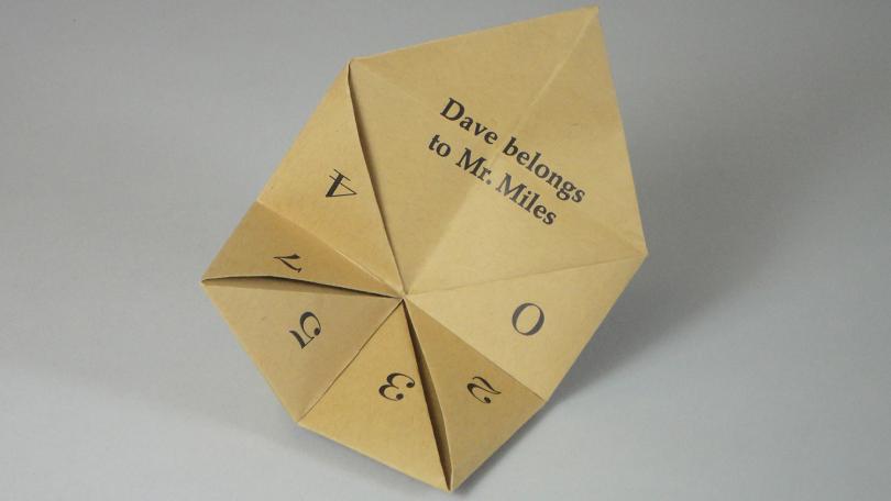
2017 Artist Book Prize co-winner
2017 Artist Book Prize co-winner "Dave's Fortune" by Asha Wills '17
This piece was created with hand-set letterpress printed type on French paper, folded into a "fortune teller" as a project for the COCO course, "Dave the Potter".
"A childhood game with a sinister twist - 'Dave's Fortune' is a reminder of his status as a slave, even with his renown as an American poet and potter. Upon first encounter with the fortune teller, one is made to choose from 4 letter, D-A-V-E. The next iteration of the fortune teller opens up the piece to reveal a series of numbers with double meaning, while prompting users to pick a fortune to reveal. The numbers also bear reminder of Dave's ceramic work, as well as his status as a slave—18[005], 20, 3/5, 7/4. The foreboding part of this fortune teller is that no matter which fortune is revealed, they all say the same inscription, taken from one of Dave's jars, "Dave Belongs to Mr. Miles." The fortune teller morphs from a childhood game to sobering reminder of an institution that stole the childhoods and livelihoods of many others like Dave." - Asha Wills '17
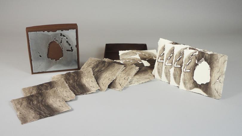
2017 Artist Book co-winner
2017 Artist Book Prize c0-winner "Arch Formation" by Alexandra Reisco '17
"This piece was inspired by the process of erosion which creates the odd but beautiful formations known as arches. In a series of etchings, the book records how over time a rock face is slowly worn down and weakened by water until a crack forms, which then opens up into a hole.
I made this book as my final piece for my Senior Seminar in Studio Art. My body of work focused on time and geologic processes, specifically how they can be emulated through etching onto a metal plate. For this piece, I decided to allow the acid to erode the plate slowly, and printed the plate at different stages to record the process over time. At the end, the acid bit a complete hole through the center of the plate, creating an object similar to an arch, in which erosion has completely worn down the central area of the rock until it disappears." - Alexandra Riesco '17
2018 Bookbinding Prize
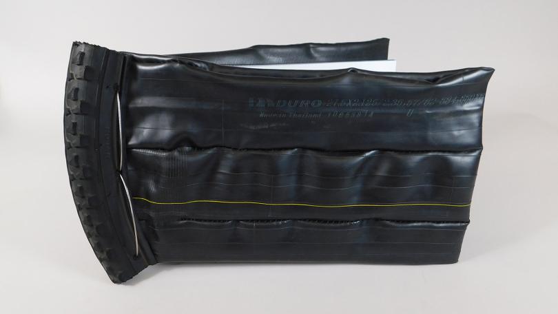
2018 Bookbinding Prize winner "Cyclicity" by Max Saylor '19
"Cyclicity is a tactile book, exploring the wonder of shapes, of bike components and an appreciation of their texture and materiality. It was created using digital photo pages, hand sewn with thread, binders board, bicycle inner tube, bicycle tire, bicycle brake cable and cable caps."
2016 Bookbinding Prize winner
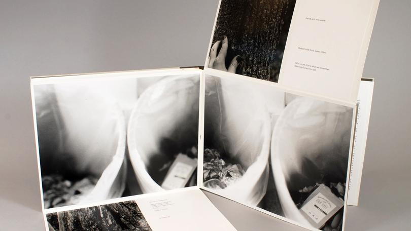
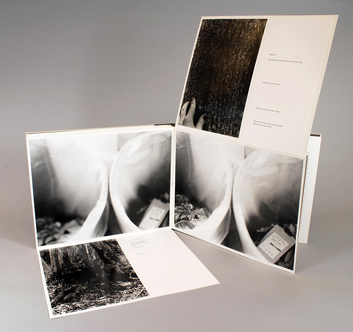
2016 Bookbinding Prize winner "Waste Land" by Amalia (Molly) Siegel '16
"This book of photographs was inspired by my interest both in the waste cycle and sense of place, which causes us to feel connected to the land. I wanted to create an object which, like the basket, feels complete and well-crafted, but could also be imagined returning to the ground." - Amalia (Molly) Siegel '16 Environmental Studies Major

2017 Letterpress Prize winner
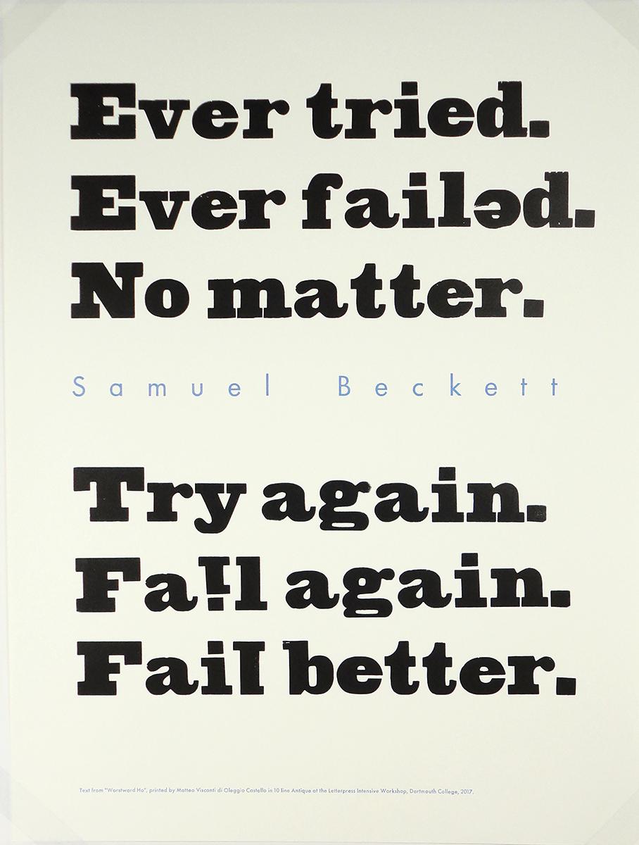
2017 Letterpress Prize winner "Fail Better" by Matteo Visconti Grad
Matteo Visconti di Oleggio Castello, PhD candidate in Cognitive Neuroscience, designed and printed this poster with wood and metal type during the Letterpress Intensive.
"I am a Ph.D. student in Cognitive Neuroscience and deeply fascinated by letterpress and Samuel Beckett." - Matteo Visconti
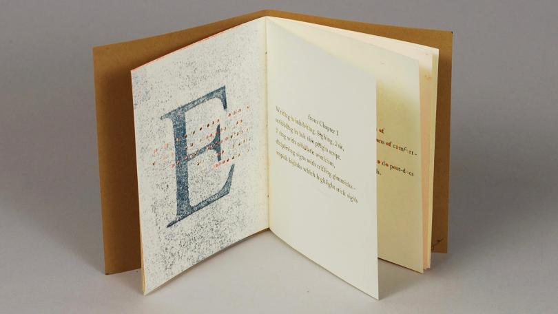
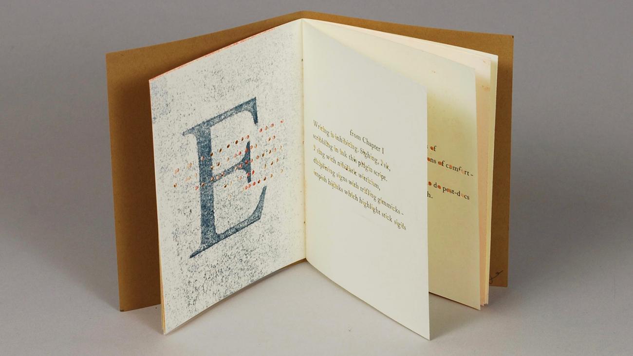
2015 Letterpress Prize winner
2015 Letterpress Prize winner "Vwls" by Carly Schnitzler '16
This book of poetry by Christian Bok, in which he employs only one vowel per poem, was hand-set and letterpress printed by Carly Schnitzler '16 - English Major, modified with Philosophy, and Minor in Ethics. On the verso side of the poems the corresponding vowels have been pressure printed in a range of colors. The vowels printed in the poems have been hand-punched out in this small edition of books.
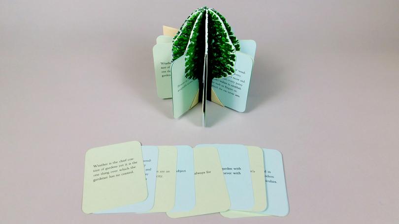
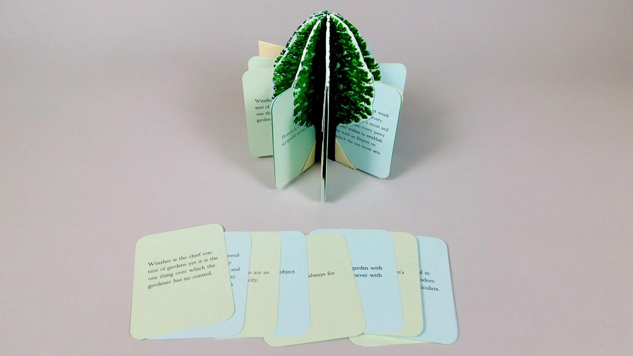
2018 Community Excellence Prize co-winner
2018 Community Prize co-winner "Detached Sentences on Gardening" by Larry Litten
"This book is a blizzard book consisting of inserted pages, upon which one of Ian Hamilton Finlay’s detached sentences on gardening is letterpress printed with metal type. Each page contains one-half of a tree, printed from hand carved relief wood blocks made from original artwork. When the book is stood on end and the pages are spread into a circle, it forms a complete tree. and hand carved relief wood blocks made from original artwork. The book is contained in a cloth covered box.
I am a passionate gardener who plans my travels in order to visit gardens (along with museums and pubs). I have become fascinated with the Scottish poet, Ian Hamilton Finlay and consider two visits to his singular garden (one in steady rain) to be the highlight of my garden visits. Within Finlay’s eclectic work, his "detached sentences" (on pebbles, friendship, weather, gardens etc) are particularly engaging. When Sarah Smith introduced me to Hedi Kyle’s blizzard book, with its detachable pages, I was compelled to explore a marriage between Kyle’s format and Finlay’s content." - Larry Litten
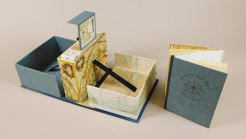
2018 Community Excellence Prize co-winner
2018 Community Prize co-winner "And So We Begin Again" by Harriette Yahr '87
"And So We Begin Again", is a book with laser printed text designed with InDesign, bound in a dos-a-dos structure, accompanied with found/hand-made objects, notes and other items, all housed in a hand-made, Cave paper covered pop-up box and a laser-cut label.
I am a writer, filmmaker and film educator who enjoys creating and exploring with Book Arts." - Harriette Yahr (D '87)